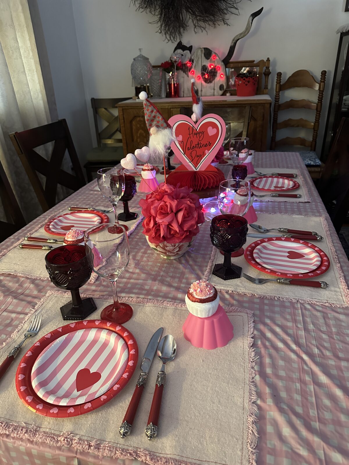
This year, my Valentine’s Day table leaned a little softer—and honestly, I loved it.
Instead of going all-in on bold red, I used lots of pink as the main color, then layered in those classic bright red Valentine accents for contrast. The result feels cheerful, cozy, and playful… without being over the top. Be sure to visit my Amazon storefront where I have Valentine’s decorating items all in one place! https://amzn.to/3ZLeTL7
A Soft, Pink-Friendly Foundation
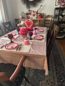
I started with a muted pink gingham tablecloth to ground everything and immediately give the table that “put together” feeling. From there, I added placemats that work beautifully with pink tones—nothing fussy, just enough texture to keep things interesting.

Pink really sets the mood here. It feels warm, welcoming, and a little more relaxed than an all-red palette, which makes it perfect for everyday Valentine decorating.
Glassware That Plays Well With Color
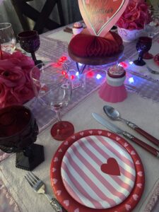
Clear glassware is one of my favorite styling tricks when I’m using a lot of color. It keeps the table from feeling too heavy and lets the pinks and reds shine without competing for attention. Plus, once the lights are on, the reflections add just the right amount of sparkle. Remember Avon’s red glassware?!
Bright Red Accents for That Classic Valentine Pop
This is where the red steps in.
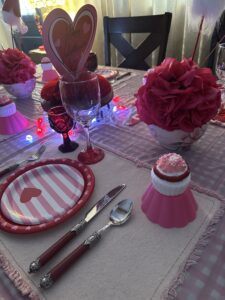
The red-handled silverware adds that unmistakable Valentine’s punch and keeps the table from feeling too pastel. It’s a small swap that makes a big impact—and it’s such an easy way to nod to the holiday without overwhelming the whole table.
A Fun, Lighthearted Centerpiece
For the centerpiece, I chose a paper honeycomb Valentine’s decoration, which fits perfectly with the playful mix of pink and red. I love pieces like this because they feel festive but not formal—and they don’t block conversation, which is always important.

Heart Lights for a Cozy Glow
The final layer (and maybe my favorite) is the lighting.
I used several strands of heart-shaped lights in both pink and red, weaving them down the center of the table. Once they’re turned on, the whole tablescape feels warm and inviting—almost like the table is glowing. It’s cozy, cheerful, and instantly sets the mood.


Why This Color Mix Works
Using pink as the main color with bright red accents keeps the table feeling balanced. Pink softens the look, while red brings in that traditional Valentine energy. Together, they create a table that feels festive, happy, and easy to live with—not stiff or overly styled.

And that’s really the point.

My grandmother “Memere Rita” made this red ceramic candy dish with lid in 1976!

Yummy cookies!
Valentine’s Day doesn’t have to be perfect or formal to be special. A few thoughtful details, a little glow, and colors that make you smile go a long way.
Happy Valentine decorating, friends. 💕 xoxo, Dana